doppiapunta
Wilewarer
 Simply an italian translator
Posts: 434
|
Post by doppiapunta on Sept 21, 2008 17:11:05 GMT -5
|
|
|
|
Post by Mejilan on Sept 21, 2008 17:30:13 GMT -5
Nicely done!  |
|
|
|
Post by Ranzor on Sept 21, 2008 19:15:45 GMT -5
Very good, indeed.
|
|
|
|
Post by Ascended Mermaid on Sept 21, 2008 19:24:00 GMT -5
It looks very good. I'm not 100% into the font style; but I like what I see so far!  Bravo! |
|
doppiapunta
Wilewarer
Simply an italian translator
Posts: 434
|
Post by doppiapunta on Sept 22, 2008 0:16:17 GMT -5
WEll just tell me which font i have to use for this game.
Write down your favourite font name and i'll try to the best.
Till that moment this is the font...since i cannot change evrytime and spend so many hours in modyfying size, checking thatstrings don't go out of bounds and so on.
I'm waiting for your font names.
Bye Bye
|
|
|
|
Post by rextor on Sept 22, 2008 1:36:23 GMT -5
Hm, maybe "BrushType", "Comic Sans MS" or "Calibri" fonts?
|
|
|
|
Post by Yakra on Sept 22, 2008 5:08:41 GMT -5
It looks really, really nice. But, yip, I agree the font could be taken as a wee bit unreadable by some. I mean, I can make sense of it, but the bars of the 'a's and 'e's being almost indistinguishable might confuse some. Erm... since you asked (and since you're open to suggestions!), I took a look at my font collection and tried to see if I could see something nice you might like. :'D These are only random suggestions though! (I mean your font is nice!!) Chronicles of a Hero Comic Sans MS Maiandra GD Tekton Pro I kind of really like Comic Sans MS because it has that slightly informal look to it while still being very readable. Buuuut... I guess some might find it boring. The other three are odd little variations of that type. (I wonder if these fonts would even work for you?  ) [If you actually do want to take a look at these and need help, I could always send them to you...?] |
|
doppiapunta
Wilewarer
Simply an italian translator
Posts: 434
|
Post by doppiapunta on Sept 22, 2008 8:22:06 GMT -5
HooterollI'm sure some of us are familiar with this font.  i forgot to tell you not to suggest hooterol in my last post since i don't want any referral to nightwolve work. more that font doesn't support accentd chars that will be used for the italian translation project: in few words i don't want to do the same work twice. however i'll check the fonts suggested.thanks |
|
|
|
Post by ryuranx on Sept 22, 2008 8:59:22 GMT -5
Nice work so far. I'm really impressed!
I'd like to suggest Calibri as font. It's the best for reading ^^
|
|
|
|
Post by minneyar on Sept 22, 2008 10:28:02 GMT -5
I'll just add in that, in general, Serif and Comic style fonts are considered to be not very good for reading on a computer display. They might look nice, but the extra fanciness makes them slower to read, and they're also harder to see at small sizes.
Usually a Sans-serif font is good for a computer display. Calibri looks pretty good; if that doesn't have the characters you need, you might also look at Bitstream Vera Sans or Verdana. Helvetica and Arial are also pretty good.
/Please/ don't use Hooteroll or Comic Sans MS. They're hard to read and they look unprofessional (how many commercial games have you seen use a font like that for their main text?)
|
|
|
|
Post by Varion on Sept 22, 2008 11:42:03 GMT -5
Don't have any suggestions to offer as I'm far from a font expert, but supporting the objection to Comic Sans MS. It is the devil.
|
|
|
|
Post by Red Hairdo on Sept 22, 2008 11:53:47 GMT -5
Good ol' Times New Roman, perhaps? Anyway, I'm liking how this is going. Ah, I can sympathize with you on that. My native language is portuguese. I know in italian you guys have the "`". Not having support to these special characters is terribly awful especially in portuguese, where we have the "`", "´", "^" and "~" over many vocal letters. Spanish also uses the "~" over some of their "n". My friend made a portuguese patch for Ys I COMPLETE, but it has none of these characters, so it's rather hard to read some words. My point is: indeed, these special characters are very welcome in a font. |
|
|
|
Post by duke4711 on Sept 22, 2008 14:18:35 GMT -5
I agree with Red Hairdo. How about Times New Roman, or maybe Arial? I'm really starting to get excited about this project!
|
|
|
|
Post by Justin on Sept 22, 2008 16:01:41 GMT -5
Times New Roman seems like a good fit to me. Things still look good.
|
|
doppiapunta
Wilewarer
Simply an italian translator
Posts: 434
|
Post by doppiapunta on Sept 22, 2008 16:15:40 GMT -5
O liked Yakra suggestions. I quite liked her suggestion..maybe being a woman has a partcular taste However...all the font suggested are farway from my original idea. I don't want to use a common font like Arial, Times New Romand and Calibri. I think there is no reason to change the font if you want one like the ones mentioned. I prefer a cool and nice font, readable but also particular. I can't believe that you can't read dialogues with the onfti i put after increasing its size. Maybe also a blind could read that However...i'mm look for some fonts and i'll do some trials. I quite like Tekton...but as i told before it's too regular. I like MCGahnanna but it doesn't have the accented letter so i have to search another one. Well i'm open to your seggestions. But please don't suggest Times New roman or Arils or Verdana... i'm surprised that no one suggested Tahoma. I don't want to write a book, i want to skin the game dialogues a little bit. Bye Bye |
|
|
|
Post by Incog Neato on Sept 22, 2008 16:33:45 GMT -5
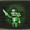
Completely off-topic here: OMG!! It's the Guardian from Ultima VII!! ^o^~ That is all. Carry on, everyone. |
|
|
|
Post by Mejilan on Sept 22, 2008 17:25:27 GMT -5
I just noticed that too. I've been playing Serpent Isle on my PSP these past few weeks. Finished up Black Gate last summer. |
|
|
|
Post by Mejilan on Sept 22, 2008 23:30:23 GMT -5
I'm with wyrdwad. Ultimately, if you're patch is going to be remembered, it'll be for the quality of the translation and hacking, not for the font aesthetics. Unless you go for a hard-to-read font, in which case your patch will be remembered for all the wrong reasons. The best fonts are the ones you don't really notice.
|
|
|
|
Post by FM-77AV on Sept 23, 2008 6:10:32 GMT -5
Comic Sans is without a doubt the worst font ever made. I can say this without even having seen every font ever made. I can't take a single word written with it seriously. I really wish it would get banned. That's actually my #1 wish in the world.
Also, arial black is impossible to read. Fortunately I have never seen it in use anywhere. I hope things will stay that way.
|
|
|
|
Post by shintenmaru on Sept 23, 2008 7:29:58 GMT -5
|
|


 )
)