|
|
Post by Ascended Mermaid on Sept 15, 2010 12:50:36 GMT -5
Yep, and I donated to him multiple times. :\ I was grateful, even though flat-out demanding *a* donation, making it a "mandatory donation" was wrong and practically extortion. But I wanted to do something somehow to apologize on behalf of the fan base, and give thanks for what he tried to do, before he decided to take it out on everyone without exclusion. I disagree with him a lot but I don't ultimately see him as a bad person. Plus what he said about Tom really pisses me off because of personal reasons involving actual crimes against my family, and the comparison he was trying to build. That said, he's still welcome here, and I've been cooperative in such ways that he should be able to come back if he so chose; I don't have to like it, but he's one of us and he has a rightful place here on ALoY all the same, he'd still have my respect. I'm not really his friend, but that doesn't mean I'm his enemy either; I'm just heavily opinionated in an otherwise entirely neutral way. Anyway, Zwei II!  Yes, keep up the good work! Looking forward to it! |
|
|
|
Post by wheels on Sept 15, 2010 13:20:52 GMT -5
Sorry for bringing things off track further! So yeah, Zwei II , just ordered it yesterday  |
|
|
|
Post by Raison D'etritus on Sept 19, 2010 17:03:37 GMT -5
(sigh) At least he's moved on from this.  -Tom I have to agree with Douche. . . errr, Nightwolve. Wyrd, by condoning animated rape, you are likewise an animated rapist. Your contribution to the project was an obvious taint and miasma, and it served to ruin the entire project. (Now I know who put in the scene where Adol told the kid from Valestein to "squeel like a Pikkard") I can tell you, I was once accosted by an animated rapist, and the scars run deep. Actually, they're 2 dimensional, but they have the optical illusion of depth. Thanks to the animated PTSD I still dream of hermaphroditic ogers every night. I am so angered by your associated rapistness that I'm going to vent my rage by murdering innocent animated hookers in GTA. . . without upsetting anybody. . . |
|
|
|
Post by tancients on Sept 19, 2010 18:58:31 GMT -5
Skywelse is making good progress, while the font person has pretty much vanished.
And that's your status update in a sentence!
|
|
|
|
Post by Lunar on Sept 19, 2010 19:54:13 GMT -5
I'm still here, I just haven't made much in the way of progress in the past week. Midterms are coming up this and next week so I was swamped in that. I have a friend here who said he could help pick up some of the slack so will see how that goes. I'm taking a break from schoolwork tonight so I'll try to get some more work in then.
|
|
|
|
Post by tancients on Sept 19, 2010 20:49:26 GMT -5
Ah ok, I didn't hear anything so I had no idea. Thanks for the update!
|
|
|
|
Post by Lunar on Sept 20, 2010 11:58:44 GMT -5
No problem. I'll try to post another picture soon, I finished those Japanese symbols you emailed me and they turned out pretty nice if I do say so myself. Also I went back and tweaked the letterforms based on the criticisms people gave in the firs t picture.
|
|
|
|
Post by Lunar on Sept 25, 2010 12:43:04 GMT -5
Fucking SUCCESS, ladies and gents. In the home stretch of the ttf. Symbols will come in due time but those aren't necessary just yet. I'm gonna be working on this all day so hopefully it will be done either tonight or tomorrow for your viewing pleasure(?), so stay tuned.
|
|
|
|
Post by SkyeWelse on Sept 25, 2010 14:49:33 GMT -5
Sounds great! Looking forward to seeing them and I can't wait to start testing them out. Hopefully they'll be Mac OSX friendly too since that is what I do all of the graphic design on. : )
-Thomas
|
|
|
|
Post by Lunar on Sept 25, 2010 15:07:54 GMT -5
I've worked with TTF on there extensively so yeah it'll be no problem.
|
|
|
|
Post by Lunar on Oct 3, 2010 22:23:11 GMT -5
www.megaupload.com/?d=ILMFU2D4Zweicurve.ttf V Alpha WHAT THIS CONTAINS -Capital A-Z -Lower Case A-Z WHAT ID DOESN'T Pretty much everything else yet Proper spacing The words space fine but a few of the individual letters (G-K are the biggest problems) need work. This should be find for just testing how it would appear in the game but besides that I wouldn't advise finalizing anything just yet. I finally have a good hang of this and midterms are over so back to the grind. Give me specific feedback as to how it works in the game so I know what to work on.
|
|
|
|
Post by SkyeWelse on Oct 4, 2010 12:32:11 GMT -5
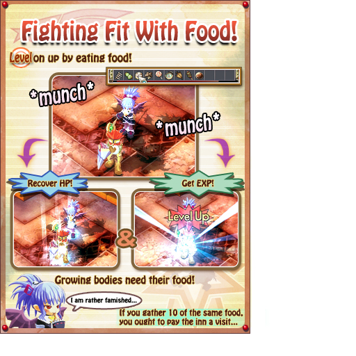
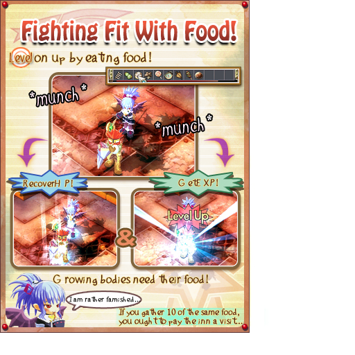
Good job on the font so far Lunar. : ) There are a few character spacing issues that may still need to be worked out, which can be seen below and if there is a way to make a bold version of the font (since the lines are very thin) it might help when or if the font needs to be emphasized more in the game. I've posted tutorial 4 below, one with the Hobo font I've been using for the bubbly letters and one that has the Zweicurve font for comparison. I think it'll definitely work for in game, but we'll have to see how easy it is to read the text from an in-game screenshot. I would like to use this font in the tutorial screens for the sound effects, for example, *Munch* *Munch* and the dialogue bubbles that the characters are saying, but I think I'd like to stick with the Hobo versions of everything else, at least as far as the tutorials go.   -Thomas |
|
|
|
Post by Lunar on Oct 4, 2010 16:14:42 GMT -5
Yeah, I'm gonna see exactly what's causing the problem tonight, because I put every character on the same part of the grid in FontCreator. Maybe I wasn't supposed to after all.
|
|
|
|
Post by tancients on Oct 4, 2010 20:37:11 GMT -5
The most noticeable problem is that the size of many of the lower case letters is the size of the upper case letters for ttf format.
For example, the height of a, c, u, should all be the same. Right now the u is as big as a U. Perhaps they got swapped around?
You can easily install the font to windows and use it in a program such as wordpad to check out what all the problems are, or simply open up the ttf in a font viewer to see. Just looking at the lowercase letters with a font viewer, the height line for lowercase characters is all over the place. The change in height from one character to the next is so drastic.
I can get an in-game screenshot in a bit when zzblue is around though, just for giggles.
|
|
|
|
Post by Lunar on Oct 4, 2010 21:50:14 GMT -5
Yeah, I was telling Tancients on AIM that this Font Creator program is a POS. I fit every single one of those lower case letters to the exact same size on the grid and it came out like that. Bolding it will be really easy and make it look better btw, good call SkyeWelse. Tom if you ever need this font for a future XSEED project you know who to ask  Okay, back to work, I'm gonna try to bang this out tonight or tomorrow. |
|
|
|
Post by cronorei on Oct 20, 2010 21:44:02 GMT -5
Lunar, Dogi here. How's the font meng?
|
|
|
|
Post by tancients on Oct 30, 2010 0:17:40 GMT -5
Yeah, I was telling Tancients on AIM that this Font Creator program is a POS. I fit every single one of those lower case letters to the exact same size on the grid and it came out like that. Bolding it will be really easy and make it look better btw, good call SkyeWelse. Tom if you ever need this font for a future XSEED project you know who to ask  Okay, back to work, I'm gonna try to bang this out tonight or tomorrow. Quite a long tonight or tomorrow.  (Been over a week since you've even signed on IM) Pretty much just waiting on the font before this is all done, figured I'd give it a bump anyway. |
|
|
|
Post by SkyeWelse on Oct 31, 2010 8:48:59 GMT -5
Figured I'd post an update as well.
Tutorials aside from the in-game screenshots that feature the final font used in-game, have all been completed. I haven't had a moments' time to work on anything else since completing the tutorials unfortunately. I've been kept very busy with work related projects and a project deadline I have to meet by Thanksgiving for a startup business.
Hopefully after Thanksgiving I can resume work as usual on this.
-Thomas
|
|
|
|
Post by tancients on Nov 7, 2010 10:39:33 GMT -5
Seeing as how it's been another week with no word, going to throw this out on the table:
If you're capable of creating a font that will work in game and meet the necessary standards of quality, send me a PM (Or if you know someone they can shoot me an e-mail).
If no progress happens font-wise after Jan, I'll probably open up donations for paying someone to make one ($250 is the price of the person I have in mind). I currently have a bit of things I'm juggling at the moment and a project I need to get done else I'd probably just spend the time to learn the mechanics of setting up a font myself.
Pretty much everything for this project is tied up waiting for a presentable quality font (the built-in English one has issues at various resolutions and suffers from wild spacing for some letters). The intent is to release it with quality.
|
|
|
|
Post by cronorei on Nov 9, 2010 1:08:15 GMT -5
I know Lunar browses /v/ but posts as anon. I could probably make some Falcom threads and try to lure him out of hiding.
|
|


